Plotting timeseries data
Contents
Plotting timeseries data
Most of the data that we want to plot with Matplotlib will be in tabular format. In the second demo of this week, we will make some plots to display daily reservoir levels of Fall Creek Reservoir in the Willamette National Forest.

Daily reservoir levels
import pandas as pd
import matplotlib.pyplot as plt

df = pd.read_csv('data/fall_creek_levels.csv')
df
| date | level | |
|---|---|---|
| 0 | 2020-11-05 | 677.94 |
| 1 | 2020-11-06 | 691.36 |
| 2 | 2020-11-07 | 693.29 |
| 3 | 2020-11-08 | 694.50 |
| 4 | 2020-11-09 | 694.56 |
| ... | ... | ... |
| 582 | 2022-06-10 | 829.63 |
| 583 | 2022-06-11 | 830.73 |
| 584 | 2022-06-12 | 830.90 |
| 585 | 2022-06-13 | 830.65 |
| 586 | 2022-06-14 | 830.19 |
587 rows × 2 columns
We can see that we have a table with two columns. The first column contains dates (from Nov 5, 2020 to June 14, 2022) and the second column contains reservoir level (in feet). Before we plot, we need to make sure that Pandas has interpreted the date column as dates.
df.dtypes
date      object
level    float64
dtype: object
While the level column has been interpeted as a float64, the date column has not been recognized as dates. We have to alert Pandas that this column contains dates using the keyword argument parse_dates when we read the file.
df = pd.read_csv('data/fall_creek_levels.csv', parse_dates=['date'])
df
| date | level | |
|---|---|---|
| 0 | 2020-11-05 | 677.94 |
| 1 | 2020-11-06 | 691.36 |
| 2 | 2020-11-07 | 693.29 |
| 3 | 2020-11-08 | 694.50 |
| 4 | 2020-11-09 | 694.56 |
| ... | ... | ... |
| 582 | 2022-06-10 | 829.63 |
| 583 | 2022-06-11 | 830.73 |
| 584 | 2022-06-12 | 830.90 |
| 585 | 2022-06-13 | 830.65 |
| 586 | 2022-06-14 | 830.19 |
587 rows × 2 columns
Now when we display the column data types, we find that the date column has been interpreted as a NumPy datetime.
df.dtypes
date     datetime64[ns]
level           float64
dtype: object
Note
parse_dates will automatically recognize and convert many common date formats. But if the date and time is formatted unusually, we might have to specify the format. We can do that using a parser function (see below).
parser = lambda date: pd.to_datetime(date).strftime('%Y-%m-%d')
df = pd.read_csv('data/fall_creek_levels.csv', parse_dates=['date'], date_parser=parser)
/var/folders/xj/5ps5mr8d5ysbd2mxxqjg3k800000gq/T/ipykernel_49651/4277095575.py:2: FutureWarning: The argument 'date_parser' is deprecated and will be removed in a future version. Please use 'date_format' instead, or read your data in as 'object' dtype and then call 'to_datetime'.
  df = pd.read_csv('data/fall_creek_levels.csv', parse_dates=['date'], date_parser=parser)
df['date']
0     2020-11-05
1     2020-11-06
2     2020-11-07
3     2020-11-08
4     2020-11-09
         ...
582   2022-06-10
583   2022-06-11
584   2022-06-12
585   2022-06-13
586   2022-06-14
Name: date, Length: 587, dtype: datetime64[ns]
Now that we have read our dataset as a DataFrame, we can plot it easily.
fig, ax = plt.subplots(figsize=(12, 6))
ax.plot(df['date'].values, df['level'].values, linewidth=2)
ax.set_title('Fall Creek Reservoir levels', fontsize=14)
ax.tick_params(axis='both', labelsize=14)
ax.set_ylabel('Level (ft)', fontsize=14)
ax.tick_params(axis='both', labelsize=14)
ax.grid()
plt.show()
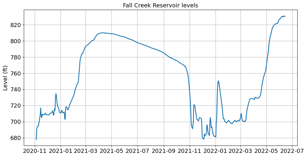
This looks great but the tick labels on the x-axis are difficult to read. We can edit the tick labels using the dates.mdates functions.
import matplotlib.dates as mdates
fig, ax = plt.subplots(figsize=(12, 6))
ax.plot(df['date'].values, df['level'].values, linewidth=2)
ax.set_title('Fall Creek Reservoir levels', fontsize=14)
ax.tick_params(axis='both', labelsize=14)
ax.set_ylabel('Level (ft)', fontsize=14)
ax.tick_params(axis='both', labelsize=14)
ax.grid()
ax.xaxis.set_major_formatter(mdates.DateFormatter('%b\n%Y')) # <-----

plt.show()
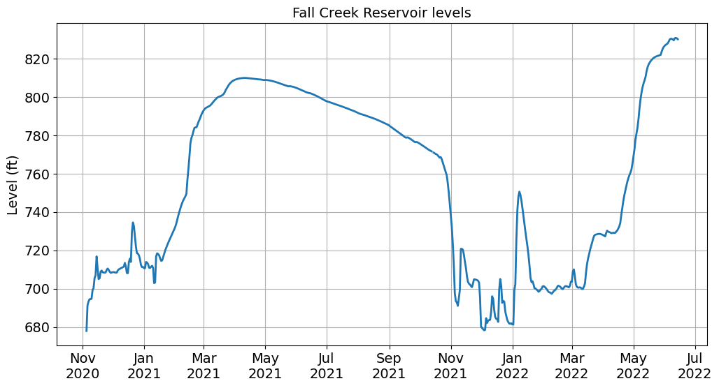
Note
We formatted the dates using an abbreviated month name (%b) followed by a new line (\n) followed by the year (%Y). See this table for more options.
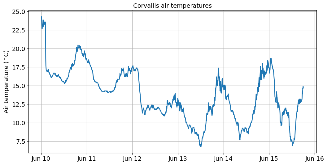
5-minute air temperature
Next we will plot some time-series data with higher temporal resolution. This file contains air temperatures from a U.S. Climate Reference Network weather station near Corvallis.
df = pd.read_csv('data/corvallis_air_temp.csv')
df
| date | time | air_temp | |
|---|---|---|---|
| 0 | 20220610 | 10 | 24.3 |
| 1 | 20220610 | 15 | 24.0 |
| 2 | 20220610 | 20 | 23.7 |
| 3 | 20220610 | 25 | 23.1 |
| 4 | 20220610 | 30 | 22.7 |
| ... | ... | ... | ... |
| 1650 | 20220615 | 1740 | 13.9 |
| 1651 | 20220615 | 1745 | 14.7 |
| 1652 | 20220615 | 1750 | 14.6 |
| 1653 | 20220615 | 1755 | 14.9 |
| 1654 | 20220615 | 1800 | 14.8 |
1655 rows × 3 columns
When we have a look at the data, we find that the dates are in one column and the time is in another. So we will use another parser function to transform dates and times in ISO 8601 format (i.e. yyyy-mm-dd hh:mm:ss)
parser = lambda date: pd.to_datetime(date).strftime('%Y%m%d %H%M')
df = pd.read_csv('data/corvallis_air_temp.csv', parse_dates={'datetime': ['date', 'time']}, date_parser=parser)
df
/var/folders/xj/5ps5mr8d5ysbd2mxxqjg3k800000gq/T/ipykernel_49651/910982156.py:2: FutureWarning: The argument 'date_parser' is deprecated and will be removed in a future version. Please use 'date_format' instead, or read your data in as 'object' dtype and then call 'to_datetime'.
  df = pd.read_csv('data/corvallis_air_temp.csv', parse_dates={'datetime': ['date', 'time']}, date_parser=parser)
| datetime | air_temp | |
|---|---|---|
| 0 | 2022-06-10 00:10:00 | 24.3 |
| 1 | 2022-06-10 00:15:00 | 24.0 |
| 2 | 2022-06-10 00:20:00 | 23.7 |
| 3 | 2022-06-10 00:25:00 | 23.1 |
| 4 | 2022-06-10 00:30:00 | 22.7 |
| ... | ... | ... |
| 1650 | 2022-06-15 17:40:00 | 13.9 |
| 1651 | 2022-06-15 17:45:00 | 14.7 |
| 1652 | 2022-06-15 17:50:00 | 14.6 |
| 1653 | 2022-06-15 17:55:00 | 14.9 |
| 1654 | 2022-06-15 18:00:00 | 14.8 |
1655 rows × 2 columns
df.dtypes
datetime    datetime64[ns]
air_temp           float64
dtype: object
fig, ax = plt.subplots(figsize=(12, 6))
ax.plot(df['datetime'].values, df['air_temp'].values, linewidth=2)
ax.set_title('Corvallis air temperatures', fontsize=14)
ax.tick_params(axis='both', labelsize=14)
ax.set_ylabel('Air temperature ($^\circ$C)', fontsize=14)
ax.tick_params(axis='both', labelsize=14)
ax.grid()
ax.xaxis.set_major_formatter(mdates.DateFormatter('%b %d'))

plt.show()
To plot air temperatures for June 13, we could slice the DataFrame using the [start:end] syntax we learnt in Week 1.
df_slice = df[863:1150]
df_slice
| datetime | air_temp | |
|---|---|---|
| 863 | 2022-06-13 00:05:00 | 13.1 |
| 864 | 2022-06-13 00:10:00 | 13.0 |
| 865 | 2022-06-13 00:15:00 | 12.7 |
| 866 | 2022-06-13 00:20:00 | 12.6 |
| 867 | 2022-06-13 00:25:00 | 12.5 |
| ... | ... | ... |
| 1145 | 2022-06-13 23:35:00 | 14.9 |
| 1146 | 2022-06-13 23:40:00 | 14.9 |
| 1147 | 2022-06-13 23:45:00 | 14.7 |
| 1148 | 2022-06-13 23:50:00 | 14.5 |
| 1149 | 2022-06-13 23:55:00 | 15.0 |
287 rows × 2 columns
But this is a little unwieldy because we have to manually find the right index for the start of June 13. A better way of doing this would be to slice by date and time. We can only do this if we make our datetime column the index column.
df.set_index('datetime', inplace=True)
df
| air_temp | |
|---|---|
| datetime | |
| 2022-06-10 00:10:00 | 24.3 |
| 2022-06-10 00:15:00 | 24.0 |
| 2022-06-10 00:20:00 | 23.7 |
| 2022-06-10 00:25:00 | 23.1 |
| 2022-06-10 00:30:00 | 22.7 |
| ... | ... |
| 2022-06-15 17:40:00 | 13.9 |
| 2022-06-15 17:45:00 | 14.7 |
| 2022-06-15 17:50:00 | 14.6 |
| 2022-06-15 17:55:00 | 14.9 |
| 2022-06-15 18:00:00 | 14.8 |
1655 rows × 1 columns
Now we can slice the DataFrame using datetime. This time we have to use the .loc function to make it clear that we are referring to the index of the DataFrame.
df_slice = df.loc['2022-06-13 00:00:00':'2022-06-13 23:55:00']
fig, ax = plt.subplots(figsize=(12, 6))
ax.plot(df_slice.index.values, df_slice['air_temp'].values, linewidth=2)
ax.set_title('Corvallis air temperatures', fontsize=14)
ax.tick_params(axis='both', labelsize=14)
ax.set_ylabel('Air temperature ($^\circ$C)', fontsize=14)
ax.set_xlabel('Time (UTC)', fontsize=14)
ax.tick_params(axis='both', labelsize=14)
ax.grid()
ax.xaxis.set_major_formatter(mdates.DateFormatter('%H:%M'))

plt.show()
Note
Now that we have set the index column to datetime, we refer to the x-axis as df_slice.index.
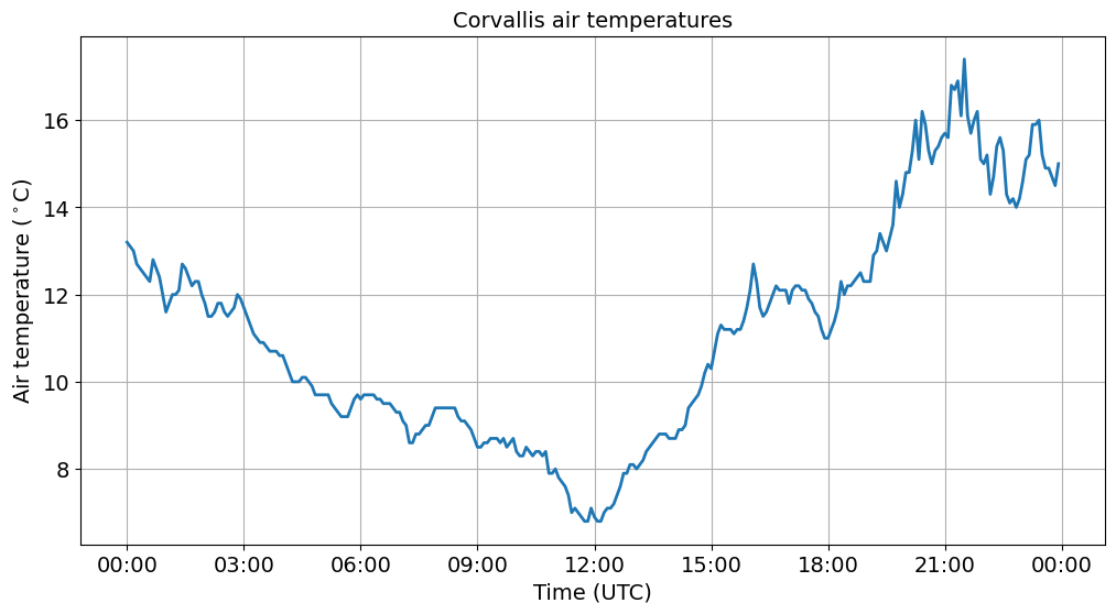
Strangely the lowest air temperatures occur at noon. This is because our data are in UTC time. So we need to convert to Pacific by subtracting eight hours from our datetime index.
df['pacific_time'] = df.index + pd.DateOffset(hours=-8)
df
| air_temp | pacific_time | |
|---|---|---|
| datetime | ||
| 2022-06-10 00:10:00 | 24.3 | 2022-06-09 16:10:00 |
| 2022-06-10 00:15:00 | 24.0 | 2022-06-09 16:15:00 |
| 2022-06-10 00:20:00 | 23.7 | 2022-06-09 16:20:00 |
| 2022-06-10 00:25:00 | 23.1 | 2022-06-09 16:25:00 |
| 2022-06-10 00:30:00 | 22.7 | 2022-06-09 16:30:00 |
| ... | ... | ... |
| 2022-06-15 17:40:00 | 13.9 | 2022-06-15 09:40:00 |
| 2022-06-15 17:45:00 | 14.7 | 2022-06-15 09:45:00 |
| 2022-06-15 17:50:00 | 14.6 | 2022-06-15 09:50:00 |
| 2022-06-15 17:55:00 | 14.9 | 2022-06-15 09:55:00 |
| 2022-06-15 18:00:00 | 14.8 | 2022-06-15 10:00:00 |
1655 rows × 2 columns
df.set_index('pacific_time', inplace=True)
df
| air_temp | |
|---|---|
| pacific_time | |
| 2022-06-09 16:10:00 | 24.3 |
| 2022-06-09 16:15:00 | 24.0 |
| 2022-06-09 16:20:00 | 23.7 |
| 2022-06-09 16:25:00 | 23.1 |
| 2022-06-09 16:30:00 | 22.7 |
| ... | ... |
| 2022-06-15 09:40:00 | 13.9 |
| 2022-06-15 09:45:00 | 14.7 |
| 2022-06-15 09:50:00 | 14.6 |
| 2022-06-15 09:55:00 | 14.9 |
| 2022-06-15 10:00:00 | 14.8 |
1655 rows × 1 columns
Now we can slice using the same syntax as before.
df_pacific_slice = df.loc['2022-06-13 00:00:00':'2022-06-13 23:55:00']
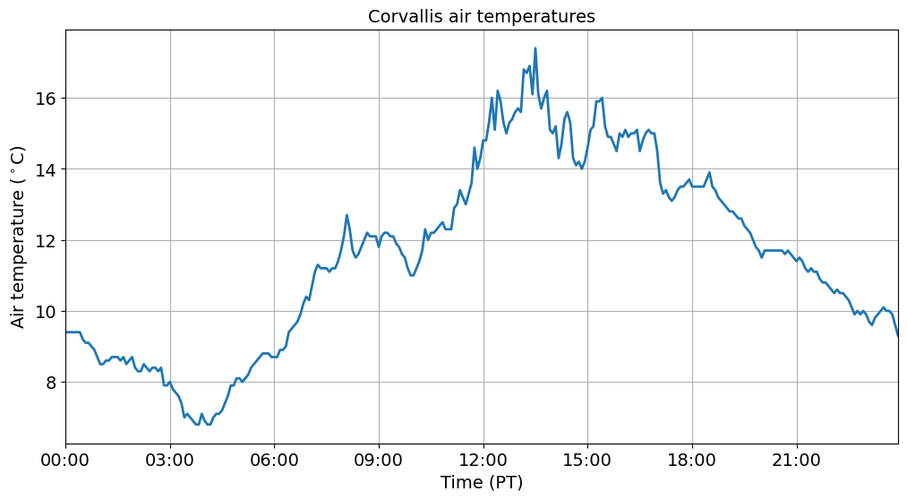
And we produce a more logical figure showing highest air temperatures at around 1 pm.
fig, ax = plt.subplots(figsize=(12, 6))
ax.plot(df_pacific_slice.index.values, df_pacific_slice['air_temp'].values, linewidth=2)
ax.set_title('Corvallis air temperatures', fontsize=14)
ax.tick_params(axis='both', labelsize=14)
ax.set_ylabel('Air temperature ($^\circ$C)', fontsize=14)
ax.set_xlabel('Time (PT)', fontsize=14)
ax.tick_params(axis='both', labelsize=14)
ax.grid()
ax.xaxis.set_major_formatter(mdates.DateFormatter('%H:%M'))
ax.set_xlim(df_pacific_slice.index[0], df_pacific_slice.index[-1])

plt.show()
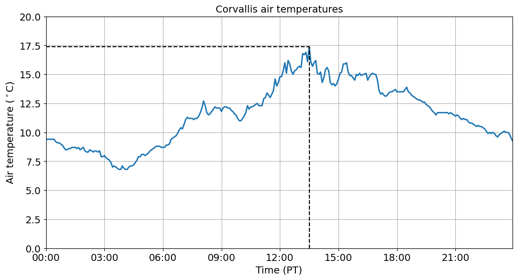
Add some extra information
We can additional information to our plots to make specific points. For example, we could add a dashed vertical line (vlines) to show when maximum air temperatures occurred or a dashed horizontal line (hlines) to show the the value of the maximum air temperature.
Note
This function has the following syntax Axes.hlines(y, xmin, xmax, colors=None, linestyles='solid', label='', *, data=None, **kwargs)
# Identify the time and value of the maximum air temperature
highest_temp_idx = df_pacific_slice['air_temp'].idxmax()
highest_temp = df_pacific_slice['air_temp'].max()
fig, ax = plt.subplots(figsize=(12, 6))
ax.plot(df_pacific_slice.index.values, df_pacific_slice['air_temp'].values, linewidth=2)
ax.set_title('Corvallis air temperatures', fontsize=14)
ax.tick_params(axis='both', labelsize=14)
ax.set_ylabel('Air temperature ($^\circ$C)', fontsize=14)
ax.set_xlabel('Time (PT)', fontsize=14)
ax.tick_params(axis='both', labelsize=14)
ax.grid()
ax.xaxis.set_major_formatter(mdates.DateFormatter('%H:%M'))
ax.set_xlim(df_pacific_slice.index[0], df_pacific_slice.index[-1])
ax.set_ylim(0, 20)

ax.vlines(highest_temp_idx, 0, highest_temp, color='k', ls='dashed')
ax.hlines(highest_temp, xmin=df_pacific_slice.index[0], xmax=highest_temp_idx, color='k', ls='dashed')
plt.show()
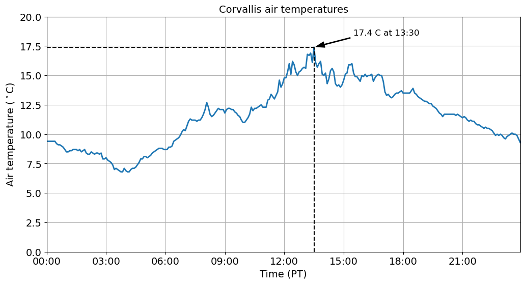
We can also add some text to our plots using the annotate function to make them even more informative. In it’s simplest form, the text is placed at xy. Optionally, the text can be displayed in another position xytext. An arrow pointing from the text to the annotated point xy can then be added by defining arrowprops.
fig, ax = plt.subplots(figsize=(12, 6))
ax.plot(df_pacific_slice.index.values, df_pacific_slice['air_temp'].values, linewidth=2)
ax.set_title('Corvallis air temperatures', fontsize=14)
ax.tick_params(axis='both', labelsize=14)
ax.set_ylabel('Air temperature ($^\circ$C)', fontsize=14)
ax.set_xlabel('Time (PT)', fontsize=14)
ax.tick_params(axis='both', labelsize=14)
ax.grid()
ax.xaxis.set_major_formatter(mdates.DateFormatter('%H:%M'))
ax.set_xlim(df_pacific_slice.index[0], df_pacific_slice.index[-1])
ax.set_ylim(0, 20)

ax.vlines(highest_temp_idx, 0, highest_temp, color='k', ls='dashed')
ax.hlines(highest_temp, xmin=df_pacific_slice.index[0], xmax=highest_temp_idx, color='k', ls='dashed')

ax.annotate(f'%.1f C at %s' % (highest_temp, highest_temp_idx.strftime('%H:%M')),
            xy=(highest_temp_idx, highest_temp),
            xytext=(highest_temp_idx+pd.DateOffset(hours=2), highest_temp+1),
            arrowprops=dict(facecolor='black', shrink=0.05, width=1, headwidth=8), fontsize=12)
plt.show()
Summary
In this demo, we were introduced to the power of Pandas for manipulating and plotting data. Next week, we will demonstrate some of the other things we can do using this library.