Making simple plots
Contents
Making simple plots
In this week, we will learn how make figures in Python. The most widely used Python library for making figures (or plots) is called Matplotlib. This library is extremely comprehensive and can be used to customize plots almost any way we want. After this week, we will never have to make plots in Excel again!
Parts of a figure
A figure is made up of several elements including axes, tick labels, axis labels, title etc.

Basic usage
To use Matplotlib, we first import it, usually as plt to improve code readability.
import matplotlib.pyplot as plt
Coding styles
Just like other libraries we have used, Matplotlib contains a collection of functions that allow us to make specific changes to a figure (e.g., create a figure, plots lines, add some labels, etc.). However, unlike other libraries, we can use Matplotlib in two different ways.
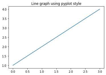
The first way is called the pyplot style which relies on Matplotlib to automatically keep track of changes we apply to the figure. The pyplot style can be very convenient for quick interactive work. We can make a simple line graph using the plot method and add a title to it using the title methods. Finally, it is good practice to add the show() method to display the figure.
plt.plot([1, 2, 3, 4])
plt.title('Line graph using pyplot style')
plt.show()
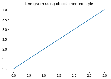
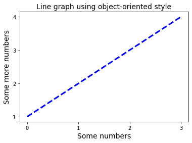
The second way is called the object-oriented style where we explicitly create the axes and call methods on them. We recommend the object-oriented style because 1) it is easier to produce more sophisticated, multi-panel plots, 2) it is easier to re-use the code, and 3) it is the style used in many of the examples on the Matplotlib documentation page.
fig, ax = plt.subplots()
ax.plot([1,2,3,4])
ax.set_title('Line graph using object-oriented style')
plt.show()
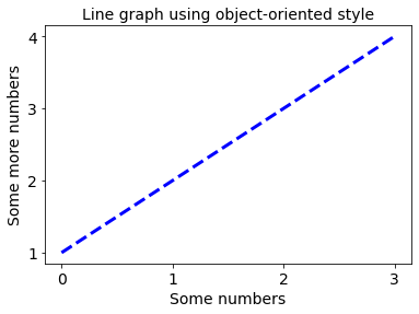
Styling
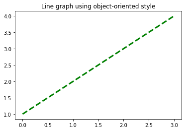
Once we have our figure, we can customize the style using keyword arguments. Most plotting methods have styling options which are accessible when the plotting method (i.e. plot) is called.
fig, ax = plt.subplots()
ax.plot([1,2,3,4], color='green', linewidth=3, linestyle='dashed') # <-----
ax.set_title('Line graph using object-oriented style')
plt.show()
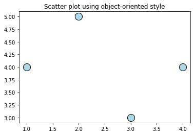
Another type of plot, called scatter, produces a scatter plot of two datasets. This type of plot allows us to customize the size of the marker, as well as the facecolor and edgecolor of the marker.
fig, ax = plt.subplots()
ax.scatter([1,2,3,4], [4,5,3,4], s=200, facecolor='lightblue', edgecolor='black') # <-----
ax.set_title('Scatter plot using object-oriented style')
plt.show()
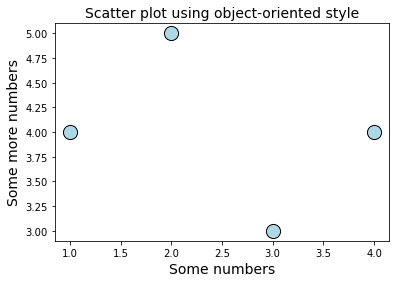
Axis labels
As well as a title, we can add x- and y-axis labels using the set_xlabel and set_ylabel methods. The font size of labels can set using the keyword argument fontsize.
fig, ax = plt.subplots()
ax.scatter([1,2,3,4], [4,5,3,4], s=200, facecolor='lightblue', edgecolor='black')
ax.set_title('Scatter plot using object-oriented style', fontsize=14)
ax.set_xlabel('Some numbers', fontsize=14) # <-----
ax.set_ylabel('Some more numbers', fontsize=14) # <-----
plt.show()
Tick labels
Each axis has a tick locator and formatter that allows us to change the location of tick marks along the axis.
fig, ax = plt.subplots()
ax.plot([1,2,3,4], color='blue', linewidth=3, linestyle='dashed')
ax.set_title('Line graph using object-oriented style', fontsize=14)
ax.set_xlabel('Some numbers', fontsize=14)
ax.set_ylabel('Some more numbers', fontsize=14)
ax.set_xticks([0, 1, 2, 3]) # <-----
ax.set_yticks([1, 2, 3, 4]) # <-----
plt.show()
We can also set the fontsize of the tick labels using the tick_params method.
fig, ax = plt.subplots()
ax.plot([1,2,3,4], color='blue', linewidth=3, linestyle='dashed')
ax.set_title('Line graph using object-oriented style', fontsize=14)
ax.set_xlabel('Some numbers', fontsize=14)
ax.set_ylabel('Some more numbers', fontsize=14)
ax.set_xticks([0, 1, 2, 3])
ax.set_yticks([1, 2, 3, 4])
ax.tick_params(axis='both', labelsize=14) # <-----
plt.show()
Legends
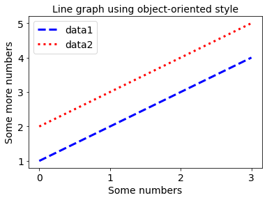
If we are plotting two datasets on the same figure, we might want to add a legend. We can do that by adding the keyword argument label to the plot function and calling the legend() function.
fig, ax = plt.subplots()
ax.plot([1,2,3,4], color='blue', linewidth=3, linestyle='dashed', label='data1') # <-----
ax.plot([2,3,4,5],color='red', linewidth=3, linestyle='dotted', label='data2') # <-----
ax.set_title('Line graph using object-oriented style', fontsize=14)
ax.tick_params(axis='both', labelsize=14)
ax.set_xlabel('Some numbers', fontsize=14)
ax.set_ylabel('Some more numbers', fontsize=14)
ax.set_xticks([0, 1, 2, 3])
ax.set_yticks([1, 2, 3, 4, 5])
ax.tick_params(axis='both', labelsize=14)

ax.legend(fontsize=14) # <-----

plt.show()
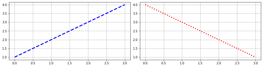
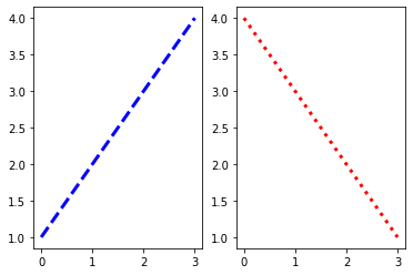
Multiple panels
We can plot our data on two axes.
fig, (ax1, ax2) = plt.subplots(ncols=2, nrows=1) # <-----

ax1.plot([1,2,3,4], color='blue', linewidth=3, linestyle='dashed')
ax2.plot([4,3,2,1],color='red', linewidth=3, linestyle='dotted')

plt.show()
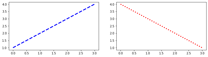
Layout
Matplotlib automatically adjusts the figure layout but we can change the size of the figure using the keyword argument figsize which accepts a numeric width and height value in inches.
fig, (ax1, ax2) = plt.subplots(ncols=2, nrows=1, figsize=(12,3)) # <-----

ax1.plot([1,2,3,4], color='blue', linewidth=3, linestyle='dashed')
ax2.plot([4,3,2,1],color='red', linewidth=3, linestyle='dotted')

plt.show()
We can use the keyword argument layout='constrained' to automatically adjust the axes so that whitespace is minimized. It is also nice to add a grid.
fig, (ax1, ax2) = plt.subplots(ncols=2, nrows=1, figsize=(12,3),
                               layout='constrained') # <-----

ax1.plot([1,2,3,4], color='blue', linewidth=3, linestyle='dashed')
ax2.plot([4,3,2,1],color='red', linewidth=3, linestyle='dotted')
ax1.grid() # <-----
ax2.grid() # <-----

plt.show()